


This is the final page with everything put together. It is 5.5in x 8.5in. The font for the chapter title is Wordy Diva 19pt, and the font for the body text is Minion Pro 12pt. The reason I chose the font I did for the chapter title is because I felt it fit nicely with the initial cap since they both have a hand written, scratchy feel to them. I chose that font for the body text because since it has serifs, it gives it a bit of an older feel to it, which is what I wanted.

The book that I chose for the project was Harry Potter and The Sorcerer's Stone. I chose the first chapter for my initial cap. I wanted to so an illustration for this project as well. This is my first sketch for my initial cap and my illustration.

This was my final illustration. I reordered some things and pushed it more in together so that it would fit better on the page. I wanted this to be the illustration because in the first chapter, it describes Mr. and Mrs. Dursley (the characters on the left and right). I added Dudley, Mr. and Mrs. Dursley's son, at the top because they put him on a high pedestal. I put Harry Potter at the bottom because he is not treated well by his aunt and uncle, as well as his cousin. I also put Harry at the bottom so that he would be placed by the chapter title, which is "The Boy Who Lived", since that is referring to him.
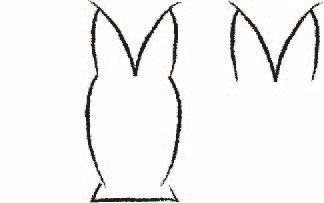
The design on the left was what i was going to put on the page at first, but I couldn't get the formatting correct, so I went with the design on the right. Since the first letter of this chapter is an 'M', I was able to design it to look like an owl. I wanted it to have the appearance of an owl because owls are mentions all throughout the story, including the first chapter.


